6 Data Visualization
In this chapter, we are going to use the dataset penguins from the package palmerpenguins. It contains size measurements for adult penguins near Palmer Station, Antarctica.
# load packages
library(tidyverse)
library(palmerpenguins)
# preview data
head(penguins)
#> # A tibble: 6 × 8
#>   species island    bill_length_mm bill_depth_mm
#>   <fct>   <fct>              <dbl>         <dbl>
#> 1 Adelie  Torgersen           39.1          18.7
#> 2 Adelie  Torgersen           39.5          17.4
#> 3 Adelie  Torgersen           40.3          18
#> 4 Adelie  Torgersen           NA            NA
#> 5 Adelie  Torgersen           36.7          19.3
#> 6 Adelie  Torgersen           39.3          20.6
#> # ℹ 4 more variables: flipper_length_mm <int>,
#> #   body_mass_g <int>, sex <fct>, year <int>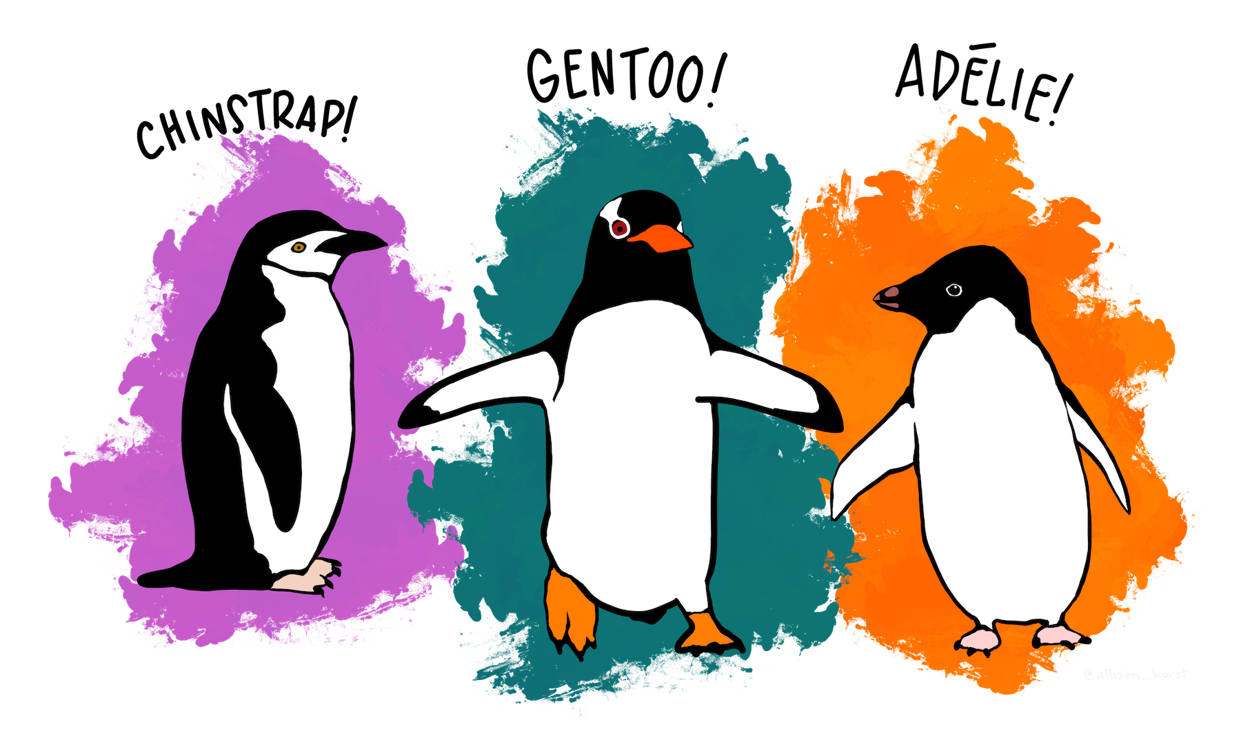
Figure 6.1: Artwork by Allison Horst
6.1 Descriptive statistics
6.1.1 Data exploration
The first step to explore data are descriptive statistics, rather than fancy visualizations. Two functions we have already encountered allow us to familiarize ourselves with the dataset:
# open the help file describing the dataset
?penguins
# call summary statistics for each variable in the dataset
summary(penguins)
#>       species          island    bill_length_mm
#>  Adelie   :152   Biscoe   :168   Min.   :32.10
#>  Chinstrap: 68   Dream    :124   1st Qu.:39.23
#>  Gentoo   :124   Torgersen: 52   Median :44.45
#>                                  Mean   :43.92
#>                                  3rd Qu.:48.50
#>                                  Max.   :59.60
#>                                  NA's   :2
#>  bill_depth_mm   flipper_length_mm  body_mass_g
#>  Min.   :13.10   Min.   :172.0     Min.   :2700
#>  1st Qu.:15.60   1st Qu.:190.0     1st Qu.:3550
#>  Median :17.30   Median :197.0     Median :4050
#>  Mean   :17.15   Mean   :200.9     Mean   :4202
#>  3rd Qu.:18.70   3rd Qu.:213.0     3rd Qu.:4750
#>  Max.   :21.50   Max.   :231.0     Max.   :6300
#>  NA's   :2       NA's   :2         NA's   :2
#>      sex           year
#>  female:165   Min.   :2007
#>  male  :168   1st Qu.:2007
#>  NA's  : 11   Median :2008
#>               Mean   :2008
#>               3rd Qu.:2009
#>               Max.   :2009
#>
Another way to inspect the data (especially with many variables) is dplyr::glimpse(). This function lists variables vertically so no no variable will be cut off because the output exceeds the console width. Note that the package dplyr is part of the tidyverse, so you can just call glimpse() when it is loaded:
# display variables vertically
glimpse(penguins)
#> Rows: 344
#> Columns: 8
#> $ species           <fct> Adelie, Adelie, Adelie, Adelie, …
#> $ island            <fct> Torgersen, Torgersen, Torgersen,…
#> $ bill_length_mm    <dbl> 39.1, 39.5, 40.3, NA, 36.7, 39.3…
#> $ bill_depth_mm     <dbl> 18.7, 17.4, 18.0, NA, 19.3, 20.6…
#> $ flipper_length_mm <int> 181, 186, 195, NA, 193, 190, 181…
#> $ body_mass_g       <int> 3750, 3800, 3250, NA, 3450, 3650…
#> $ sex               <fct> male, female, female, NA, female…
#> $ year              <int> 2007, 2007, 2007, 2007, 2007, 20…
To produce well-formatted descriptive statistics I recommend the function datasummary_skim() from the package modelsummary. In addition to common summary statistics like minimum, maximum, mean, median and standard deviation it even comes with a small histogram of each distribution. The biggest advantage, however, is the option to produce nicely formatted output in a variety of formats, such as markdown, LaTeX and html. In an html document like the one you are reading, the output from the line below is automatically embedded:
library(modelsummary)

# descriptive statistics
datasummary_skim(penguins)| Unique (#) | Missing (%) | Mean | SD | Min | Median | Max | ||
|---|---|---|---|---|---|---|---|---|
| bill_length_mm | 165 | 1 | 43.9 | 5.5 | 32.1 | 44.5 | 59.6 | |
| bill_depth_mm | 81 | 1 | 17.2 | 2.0 | 13.1 | 17.3 | 21.5 | |
| flipper_length_mm | 56 | 1 | 200.9 | 14.1 | 172.0 | 197.0 | 231.0 | |
| body_mass_g | 95 | 1 | 4201.8 | 802.0 | 2700.0 | 4050.0 | 6300.0 | |
| year | 3 | 0 | 2008.0 | 0.8 | 2007.0 | 2008.0 | 2009.0 |
6.1.2 Exercises
These exercises are meant both as a recap of the previous session and to practice your ability to create summary statistics.
6.1.2.1 Question 1
Find out why some variables are ignored by modelsummary::datasummary_skim() and modify your code to get descriptive statistics for those, too. You can open the help file of this function by typing ?modelsummary::datasummary_skim or by hitting the F1 key with the function name selected in your code.
Answer
By default, datasummary_skim() presents only continuous variables and ignores categorical ones. To let it summarize categorical variables, specify the argument type = "categorical" in your function call. Note that it gives you counts and percentages for each level of the categorical variable. This is the reason why this output does not blend well with that of continuous variables so both are kept separately from each other.
# descriptive statistics for categorical variables (default is "numeric")
datasummary_skim(penguins, type = "categorical")| N | % | ||
|---|---|---|---|
| species | Adelie | 152 | 44.2 |
| Chinstrap | 68 | 19.8 | |
| Gentoo | 124 | 36.0 | |
| island | Biscoe | 168 | 48.8 |
| Dream | 124 | 36.0 | |
| Torgersen | 52 | 15.1 | |
| sex | female | 165 | 48.0 |
| male | 168 | 48.8 |
6.1.2.2 Question 2
Read the help file for modelsummary::datasummary_crosstab() and find out how to interpret the output below. For example, what does the second line (% row 26.2 0.0 73.8 100.0) tell you?
datasummary_crosstab(island ~ species, data = penguins)| island | Adelie | Chinstrap | Gentoo | All | |
|---|---|---|---|---|---|
| Biscoe | N | 44 | 0 | 124 | 168 |
| % row | 26.2 | 0.0 | 73.8 | 100.0 | |
| Dream | N | 56 | 68 | 0 | 124 |
| % row | 45.2 | 54.8 | 0.0 | 100.0 | |
| Torgersen | N | 52 | 0 | 0 | 52 |
| % row | 100.0 | 0.0 | 0.0 | 100.0 | |
| All | N | 152 | 68 | 124 | 344 |
| % row | 44.2 | 19.8 | 36.0 | 100.0 |
Answer
This function cross-tabulates your data. That means it gives you counts and percentages for each combination of the two (categorical) variables you specified with island ~ species. This notation is called a two-sided formula in R: anything left of the tilde sign determines what will be displayed as rows; anything right of it will be shown as columns.
Thus, the second line highlighted in the question gives you a breakdown of the penguin species on the island of Biscoe: 26.2% are Adelie penguins; the rest belongs to the Gentoo species.
6.1.2.3 Question 3
Provide an alternative way to answer the previous question using only tidyverse functions, such as count().
Answer
This exercise is pure repetition from the section on the tidyverse.
The cross-tabulation gives you counts and percentages for each combination of species and island so we will have to group the data by these two variables. Then we summarize the data to get the number of entries of each group with n() and call this number n. Next, we compute the share of species on each island as n over the sum of observations for each island.
Note that after the first summarize() command, our data is still grouped by island so we do not have to group it again – sum(n) will correctly sum all observations for each island. If you are unsure what the intermediate results of a longer pipe look like, try selecting only the steps you are interested in and running those.
penguins %>%
  group_by(island, species) %>%
  summarize(n = n()) %>%
  mutate(share = n / sum(n))
#> # A tibble: 5 × 4
#> # Groups:   island [3]
#>   island    species       n share
#>   <fct>     <fct>     <int> <dbl>
#> 1 Biscoe    Adelie       44 0.262
#> 2 Biscoe    Gentoo      124 0.738
#> 3 Dream     Adelie       56 0.452
#> 4 Dream     Chinstrap    68 0.548
#> 5 Torgersen Adelie       52 1
If we use the function count() as suggested in the question, we can save one line of code. This is because the function call count(species) is equivalent to two operations (grouping and summarizing) from above: group_by(species) %>% summarize(n = n()).
penguins %>%
  group_by(island) %>%
  count(species) %>%
  mutate(share = n / sum(n))
#> # A tibble: 5 × 4
#> # Groups:   island [3]
#>   island    species       n share
#>   <fct>     <fct>     <int> <dbl>
#> 1 Biscoe    Adelie       44 0.262
#> 2 Biscoe    Gentoo      124 0.738
#> 3 Dream     Adelie       56 0.452
#> 4 Dream     Chinstrap    68 0.548
#> 5 Torgersen Adelie       52 1
6.1.2.4 Question 4
Use filter() to find out how many observations are lacking information on bill_length_mm.
Answer
Again, this is repetition from the section on the tidyverse. The function filter() helps you retain only the rows of a dataset that match a certain logical condition. To check if a value is missing we have to use the function is.na() rather than the usual logical operators such as |, &, == and !.
In this small dataset, we see immediately that two rows are lacking information on bill_length_mm. In a bigger dataset, it might make sense to let R count the number of rows with nrow().
6.1.2.5 Question 5
Create a binary variable big_boy that equals 1 if a penguin is male and weighs more than 4000 grams. Make sure to overwrite the dataset penguins to make this change permanent.
Answer
To create a new column in a dataset, use mutate() and define a new column (here: big_boy) as a function of existing ones. In our case, the new column is the value of a logical operation so its values will be boolean (either TRUE or FALSE). Note that the parentheses around the logical condition are optional in the code below but help separate it from the assignment to a new variable:
If this way of defining a new column seems outlandish to you, try inspecting the object at each point of the transformation. In this toy example, the object sex is a vector of either “male” or “female”.
sex <- c("male", "female", "male", "male")When we perform a logical operation on it, the result will be a vector of boolean values.
sex == "male"
#> [1]  TRUE FALSE  TRUE  TRUE
When we make this operation more complex (as in sex == "male" & body_mass_g > 4000) and apply it to the actual variable sex from our dataset, the result will still be a logical vector which we can add as a new column called big_boy.
6.1.2.6 Question 6
Calculate the mean weight (body_mass_g) for male and female penguins.
Answer
This is another straightforward application of tidyverse syntax. summarize() returns one line per level of the grouping variable sex. We could remove the summary line for entries lacking information on sex by filtering at any point in the pipe. Note that you might want to specify the na.rm = TRUE argument within mean() to ignore missing values.
penguins %>%
  group_by(sex) %>%
  summarize(mean_weight = mean(body_mass_g))
#> # A tibble: 3 × 2
#>   sex    mean_weight
#>   <fct>        <dbl>
#> 1 female       3862.
#> 2 male         4546.
#> 3 <NA>           NA
For completeness: for functions commonly used as summary statistics such as mean(), we could also use the package modelsummary to produce nicely formatted output in a variety of formats:
datasummary(body_mass_g ~ mean * sex, data = penguins)| female | male | |
|---|---|---|
| body_mass_g | 3862.27 | 4545.68 |
6.1.2.7 Question 7 ⚠️
Calculate the male-to-female ratio for each year. Feel free to ignore observations for which the variable sex has missing values.
Answer
This is a slightly more involved chain of functions, so we will develop it step by step. As is often the case in R, there are various ways to solve the problem. We will discuss three of them here. Each of them introduces an advanced but common technique: reshaping data, subsetting data and merging datasets.
The first thing we would like to do is to count the number of male and female penguins in each year. Similar to previous questions, we group the data twice and compute the count or use the function count() to save one line of code. In the code chunk below, missing values have been excluded at the top of the pipe:
# count males and females per year
counted <- penguins %>%
  filter(!is.na(sex)) %>%
  group_by(year) %>%
  count(sex)

counted
#> # A tibble: 6 × 3
#> # Groups:   year [3]
#>    year sex        n
#>   <int> <fct>  <int>
#> 1  2007 female    51
#> 2  2007 male      52
#> 3  2008 female    56
#> 4  2008 male      57
#> 5  2009 female    58
#> 6  2009 male      59
From here, there are two ways to calculate the ratio in each year. For the first one, note that we could easily compute the new variable as the ratio of two existing ones if we had one column for each sex in our dataset. To reshape our data this way, we can use pivot_wider():
# reshape data wider
counted %>%
  pivot_wider(
    names_from = sex,
    values_from = n
  )
#> # A tibble: 3 × 3
#> # Groups:   year [3]
#>    year female  male
#>   <int>  <int> <int>
#> 1  2007     51    52
#> 2  2008     56    57
#> 3  2009     58    59
Now all that is left is to calculate the ratio with summarize(ratio = male / female).
The second approach makes use of the fact that our data is still grouped by year after counting. Note that within each group, both variables sex and n are vectors of length two. To compute the ratio of elements from the same vector, we use logical subsetting: n[sex == "male"] picks the element of the vector n where sex equals "male". So an even more concise (but perhaps less intuitive) chunk of code would look like this:
counted %>% summarize(ratio = n[sex == "male"] / n[sex == "female"])
#> # A tibble: 3 × 2
#>    year ratio
#>   <int> <dbl>
#> 1  2007  1.02
#> 2  2008  1.02
#> 3  2009  1.02
There exists a third way that does not rely on grouping the data according to sex. Instead of grouping, we divide our dataset into two by filtering, count the number of observations per year and then merge the datasets together to compute the ratio.
# separate male from female penguins and count per year
male <- penguins %>%
  filter(sex == "male") %>%
  count(year, name = "n_male")

female <- penguins %>%
  filter(sex == "female") %>%
  count(year, name = "n_female")

# merge and compute ratio
male %>%
  left_join(female, by = "year") %>%
  summarize(ratio = n_male / n_female)
#> # A tibble: 3 × 1
#>   ratio
#>   <dbl>
#> 1  1.02
#> 2  1.02
#> 3  1.02
To conclude: each of these approaches is valid in its own right. The second solution (using logical subsetting) might be fastest but also the most error-prone: if we had not removed missing values before, we would have to treat the logical conditions differently. Reshaping the data, on the other hand, is much more transparent. In case you wondered: the male-to-female ratio is not actually constant across years but the rounded values are.
6.2 Data visualization
Having explored our data, let us now go on and visualize it. Before we learn the syntax to create plots with the package ggplot2, however, we will use some bad visualizations to illustrate (the breach of) basic design principles and sharpen our eyes for the concept of aesthetic mappings.
6.2.1 Bad visualizations
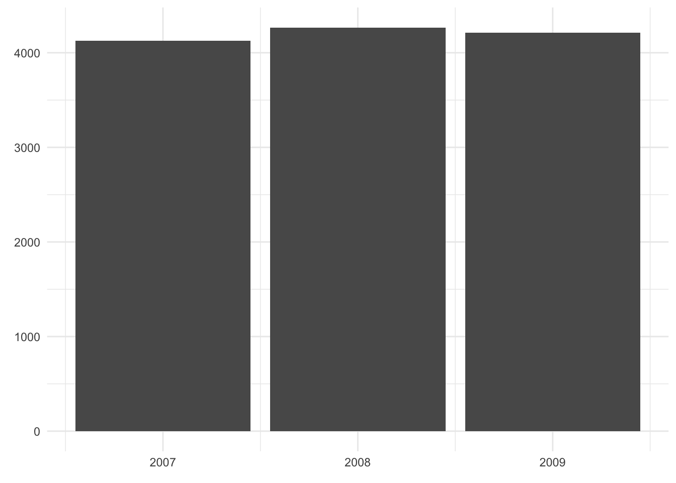
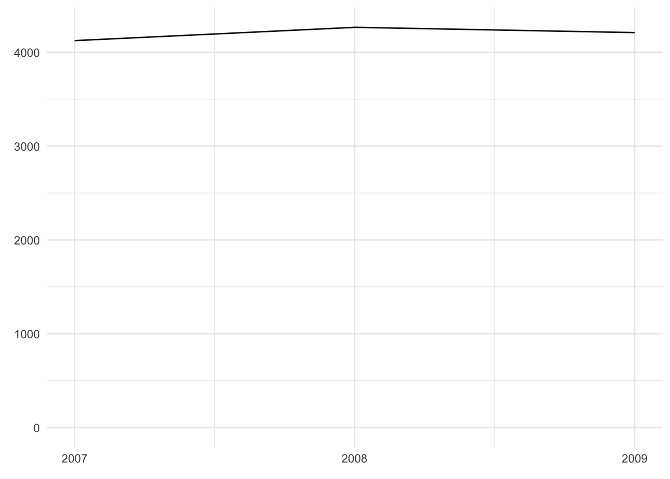
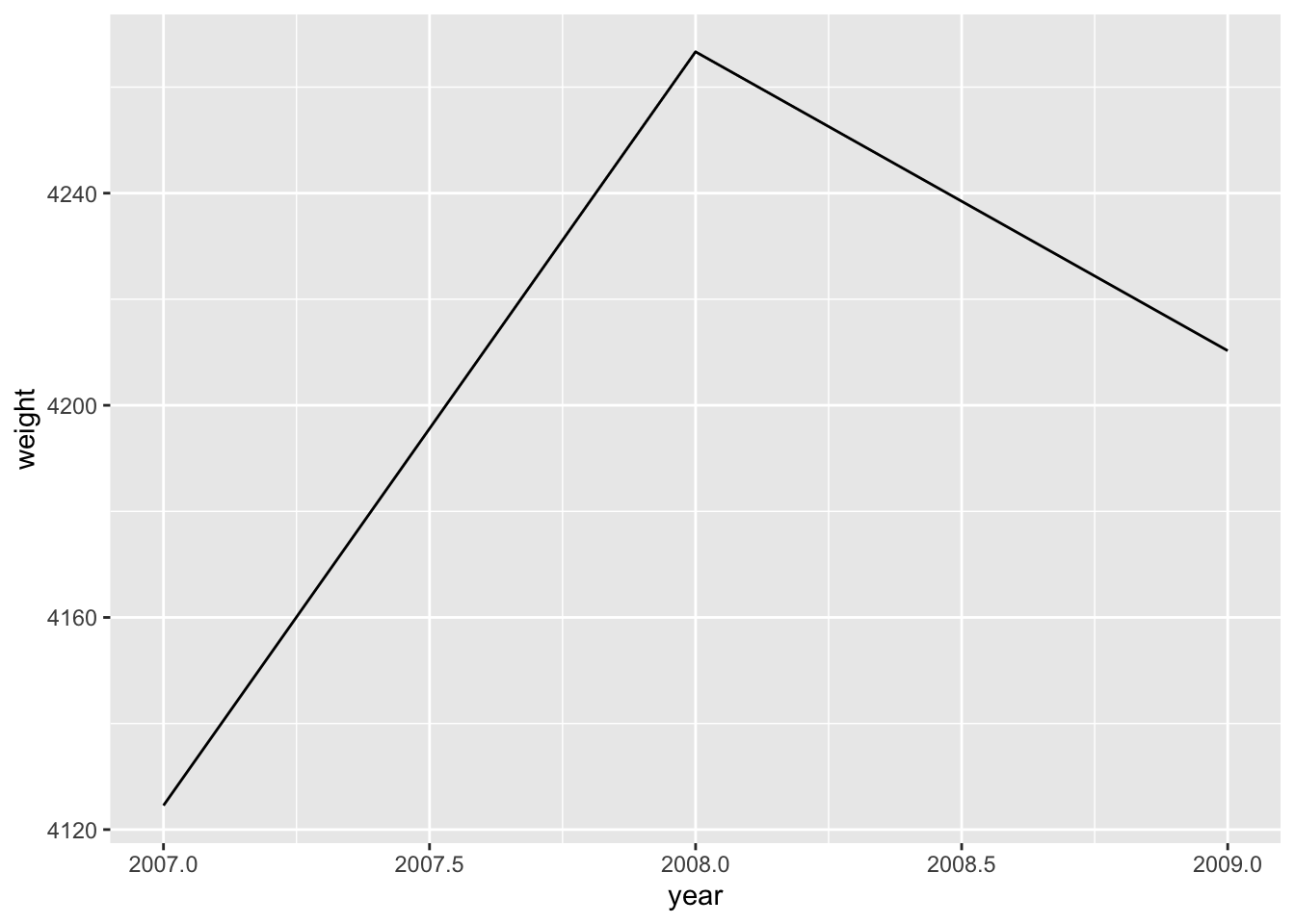
The following visualizations are all based on the dataset penguin_weight which only consists of three data points: the mean penguin weight in each year.
penguin_weight <- penguins %>%
  group_by(year) %>%
  summarize(weight = mean(body_mass_g, na.rm = TRUE))

penguin_weight
#> # A tibble: 3 × 2
#>    year weight
#>   <int>  <dbl>
#> 1  2007  4125.
#> 2  2008  4267.
#> 3  2009  4210.
As an exercise, have a look at the three plots below and explain
- how variables (or rather: their values) are mapped to certain features of the plot;
- what kind of visualization is most effective.
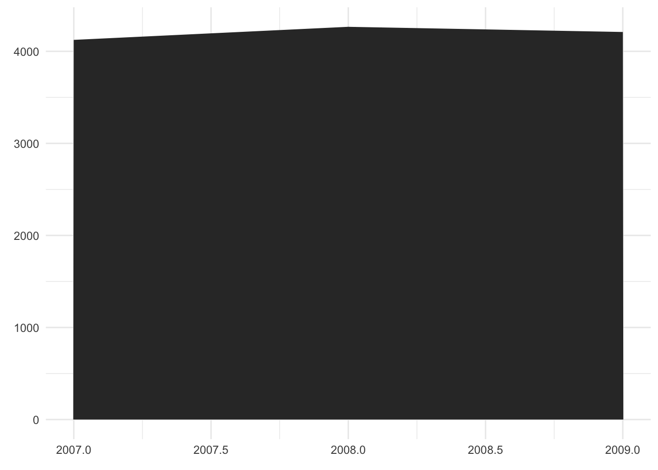
Comment
- The two variables (
yearandweight) are mapped to the x-axis and the y-axis. - It is a bad plot mainly because it is a stacked area chart that is usually used to show changes in composition over time. For example, to track the German response to Russia’s aggression against Ukraine, we could plot the energy imports from Russia broken down into oil, gas and coal. However, in this example we only have a single data point per year.
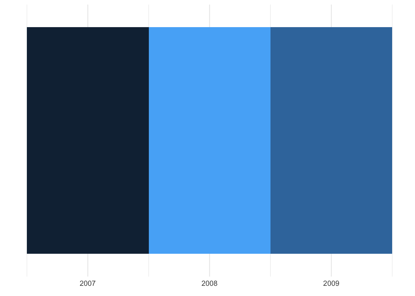
Comment
- As before, the year is represented on the x-axis. The weight, however, is mapped to the color shade instead of the y-axis.
- It is a bad visualization because even with a legend for the color shade, exact values would be hard to infer.
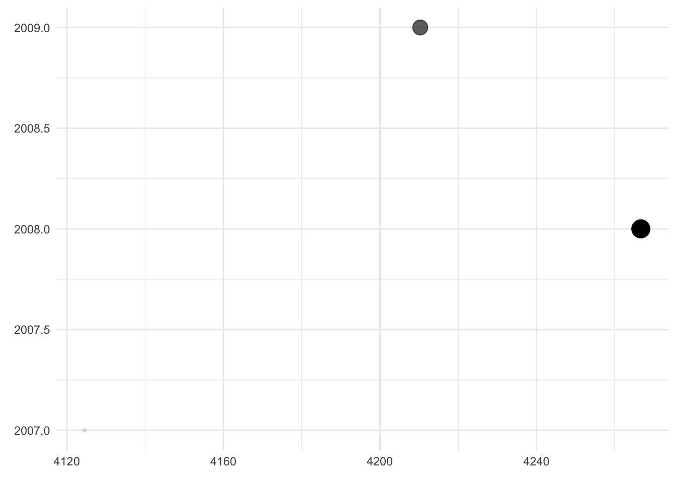
Comment
- Here,
weightandyearare still mapped to the axes of the plot but in reversed order. In addition,weightis mapped to the transparency and the size of the dots. - It is a bad visualization because the “dependent” variable is not on the y-axis and because the x-axis is truncated. This suggests more variation in the data than there actually is. The fact that
weightis additionally mapped to dot size and transparency does not add any information – if anything, it confuses the reader.
Now take pen and paper and try to sketch an effective visualization of our data!
My take
We can make the plot more effective by sticking to basic design principles:
- Make the plot as simple as possible. Any embellishments should have a purpose.
- Stick to viewing conventions. Time is usually best presented on the horizontal axis, from left to right.
- Remove redundancy. Mapping a variable to more than one graphical feature of the plot can be confusing.
- Stick to the most intuitive visuals. The human brain is much better at comparing two numbers represented by the length of a bar rather than by the shade of a color or the transparency of a dot.
- Mind your medium and the color blind. Print publications may only offer black and white or grayscale. If you do use colors, make sure to use a palette that works for common forms of color blindness.
Based on these principles, I suggest a bar chart (if we want to emphasize the distinctness of each year) or a line graph (if we want to emphasize the trajectory over time):
6.2.2 How to build a ggplot
The package ggplot2 (think: “The Grammar of Graphics”) provides functions to create (layered) plots and to specify aesthetic mappings explicitly. To create a plot you will need to determine the
- dataset
- plot type
- aesthetic mapping (i.e., which variable goes where)
Additionally, you have the option to change the look and feel of your plot by adding titles, captions, axis labels, modifying axis scaling and tick marks, color themes and so on.
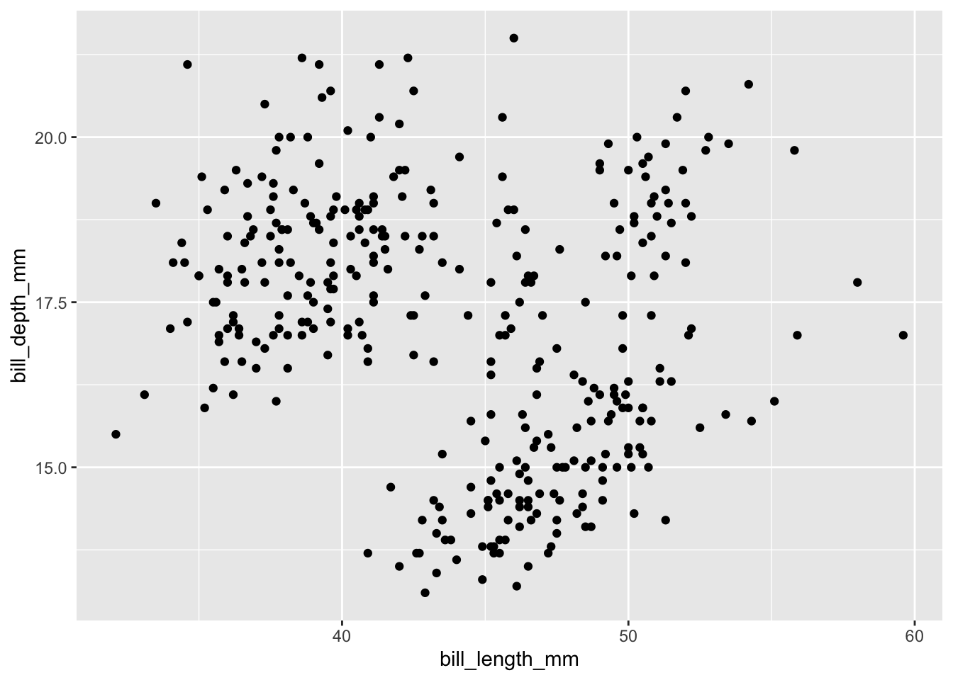
Let’s have a look at a simple example: the scatter plot. We will ask the question whether bill length and depth are correlated.
Before we look at the actual code, let us form expectations using pseudo code. If you are coming from Stata or “base R”, you might expect something like the following given that we need to specify the dataset, plot type, and aesthetic mapping:
plot(
  data = penguins,
  type = scatterplot,
  x = bill_length_mm,
  y = bill_depth_mm
)
The ggplot2 code, however, looks quite different at first glance:
ggplot(data = penguins,
       mapping = aes(x = bill_length_mm, y = bill_depth_mm)) +
  geom_point()
There are several things to note here.
- Two functions are necessary to create the plot
- The plot object is being “piped” from function to function by using a special syntax (
+instead of%>%) - The three necessary components (dataset, plot type, and aesthetic mapping) are reflected as
- argument
data = -
geom_*function - argument
mapping =
- argument
- The argument
mappingdoes not accept variables for “x” and “y” directly; you will have to wrap them inside the functionaes()
Before we discuss the rationale behind the design choices of the ggplot2 interface, let us make the code more concise. As always in R, you can omit the argument names if you provide them in the default order (documented in the help file). Thus we can rewrite the above code as
ggplot(penguins, aes(bill_length_mm, bill_depth_mm)) +
  geom_point()
The most obvious design choice – piping the plot through various functions – allows us to iteratively build up the plot. The additions could be tweaks to the appearance of the plot or additional layers provided by geom_* functions. We will first explore the latter by adding another layer with smoothed conditional means of the same data:
ggplot(data = penguins,
       mapping = aes(x = bill_length_mm, y = bill_depth_mm)) +
  geom_point() +
  geom_smooth()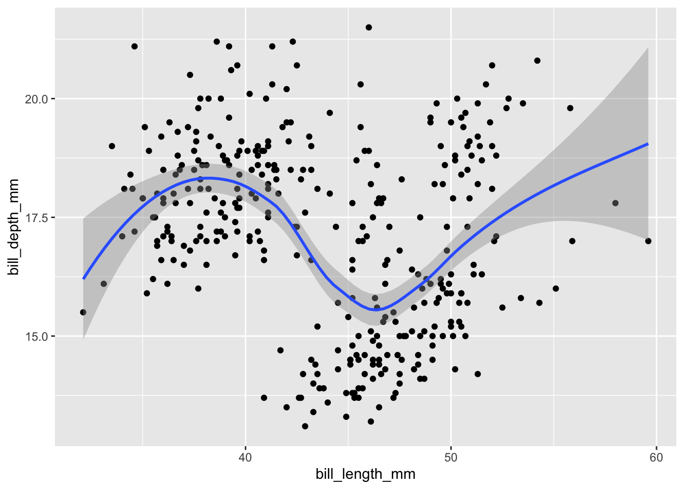
If you run an “unfinished” pipe, i.e. a sequence of ggplot2 functions ending in a plus sign, the console will tell you that it is waiting for more input by displaying a plus sign as well. To abort this operation, make sure your console is focused and hit the escape key.
Layers/geoms are powerful because each one can use a different combination of data and mapping. For example, we could restrict our smoothed line to Adelie penguins:
ggplot(data = penguins,
       mapping = aes(x = bill_length_mm, y = bill_depth_mm)) +
  geom_point() +
  geom_smooth(data = filter(penguins, species == "Adelie"))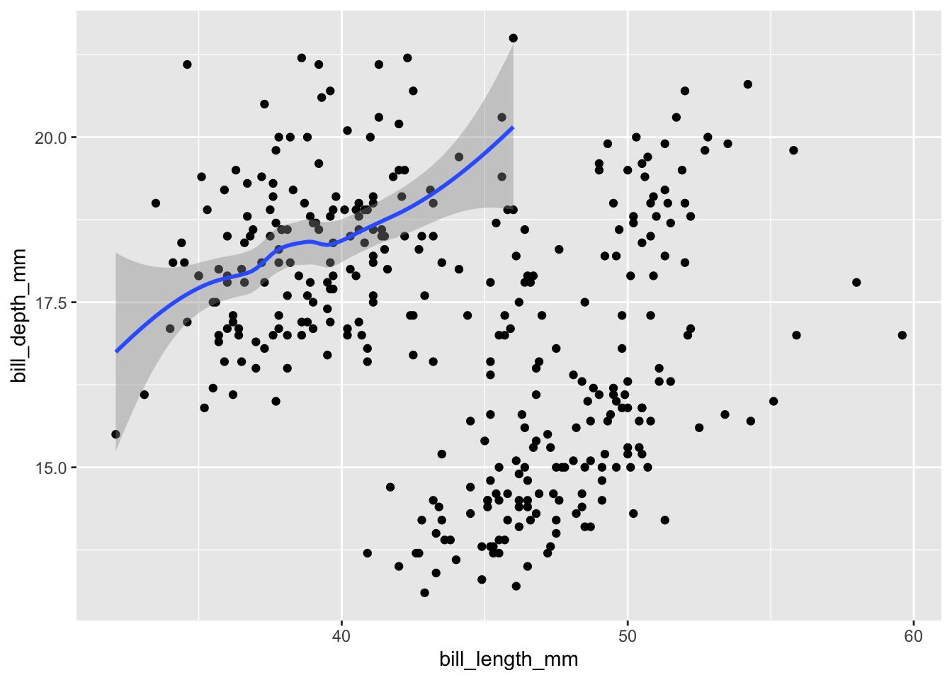
If you specify data and mapping within ggplot(), all layers/geoms will use them by default. If you specify them within an individual geom, their scope will be limited to this geom only.
The question why you have to wrap the aesthetic mapping in aes() is more subtle. In short, it allows you to refer to variables (e.g., bill_length_mm) from the dataset directly rather than having to call them using the dollar sign (penguins$bill_length_mm). This functionality is similar to other tidyverse functions like mutate() or select().
The usage of aes(), however, should be clear: you can use it to create a mapping of variables from the dataset to visual features of the plot by specifying name-value pairs (such as x = bill_length_mm from above). Depending on the plot type, some are necessary, some are optional. Of course, in our scatter plot both x and y coordinates are needed to determine the correct position of a dot. We can squeeze in even more information into the plot by specifying additional name-value pairs:
# color dots according to species
ggplot(data = penguins,
       mapping = aes(
         x = bill_length_mm,
         y = bill_depth_mm,
         color = species)) +
  geom_point()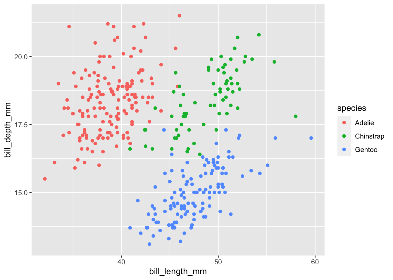
Any aesthetic that you would like to set to a fixed value goes outside of aes(): for example, geom_point(color = "red") turns all dots red.
6.2.3 Statistical transformations & the position argument
We will discuss another geom: the bar chart. First, because it is one of the most basic ones; second, because it allows us to introduce the position argument.
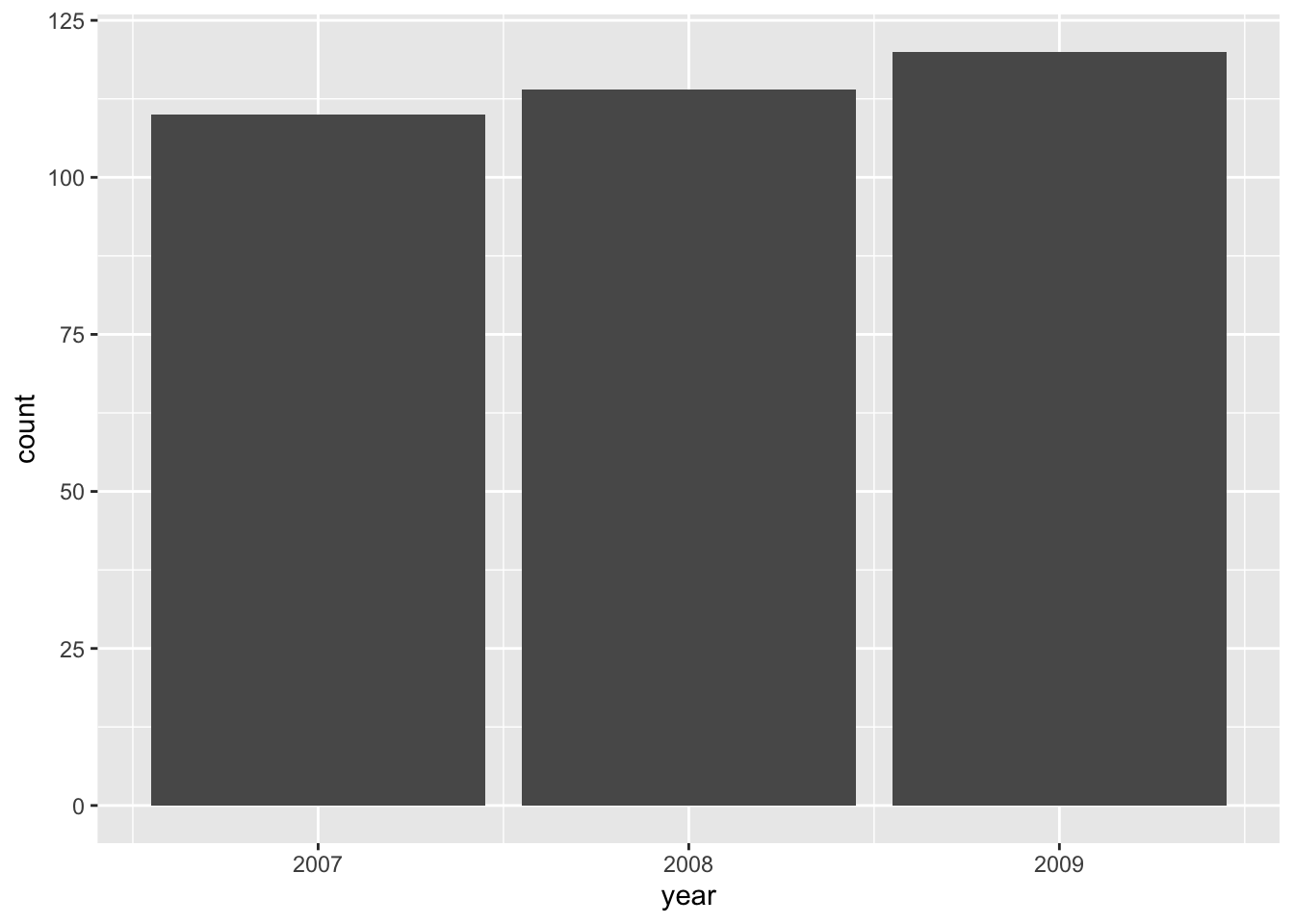
Note that the values on the y-axis do not exist in the original dataset. geom_bar() automatically groups and counts entries, similar to
penguins %>%
  count(year)
#> # A tibble: 3 × 2
#>    year     n
#>   <int> <int>
#> 1  2007   110
#> 2  2008   114
#> 3  2009   120
This behavior is called a “statistical transformation” and is the default for certain geoms.
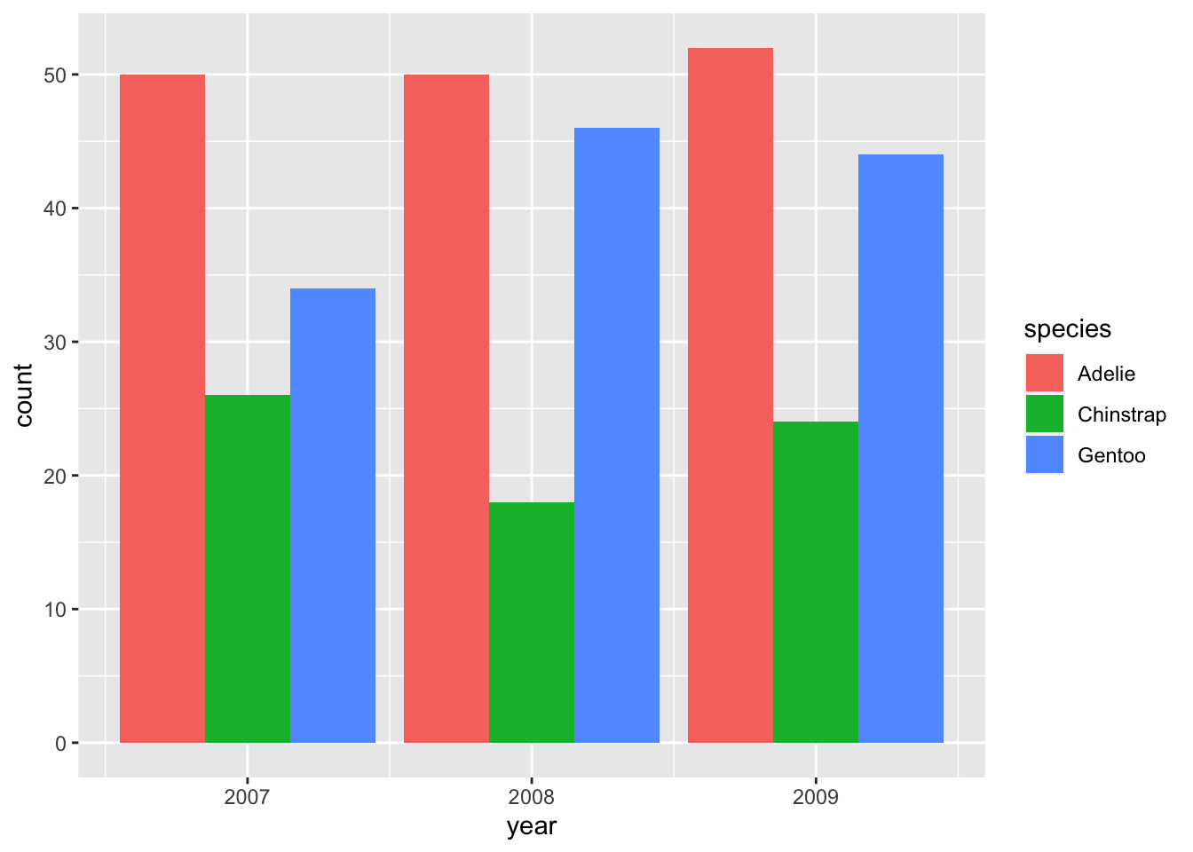
Positioning is not an issue yet: there is only one bar representing each year. We can subdivide each bar according to the species observed during each year by mapping the variable species to the fill aesthetic:
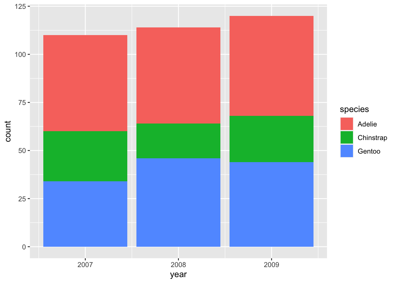
For each year, we now have three bars that are automatically stacked upon each other. This is equivalent to the option position = "stack" (specified outside of aes() because it is a fixed value, not an aesthetic mapping):

There are two other options for the position argument: "identity" and "dodge". The former is less useful because it positions all bars at zero instead of stacking them so that the smaller bars are hidden behind taller ones. "dodge" is more useful and commonly employed to show changes in composition:
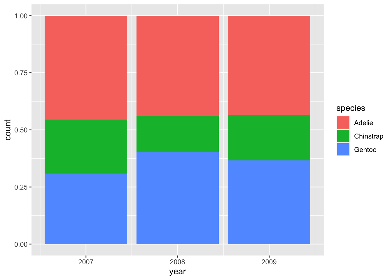
If you only care about relative proportions, "fill" may be the position argument of your choice:
6.2.4 Grouping and small multiples
Just like working with grouped data inside of tibbles, we can visualize each group of observations separately. We have already seen one example of this: mapping the color aesthetic to a variable also groups data in the plot:
# create base plot
bill_plot <- ggplot(penguins, aes(bill_length_mm, bill_depth_mm)) +
  geom_point()

bill_plot +
  geom_smooth(aes(color = species))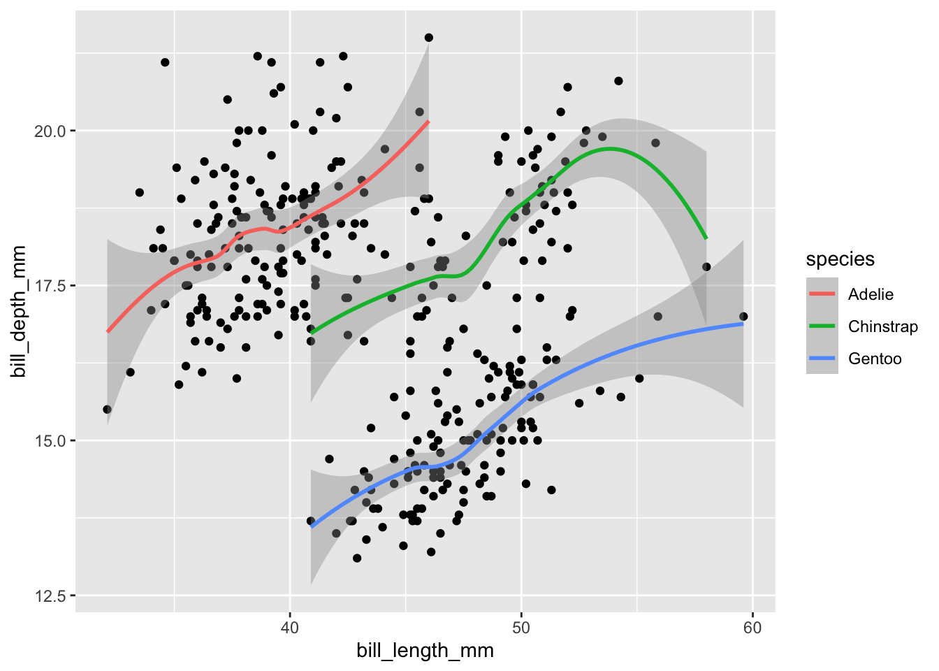
To group data explicitly (without affecting their color), create an aesthetic mapping with group:
bill_plot +
  geom_smooth(aes(group = species))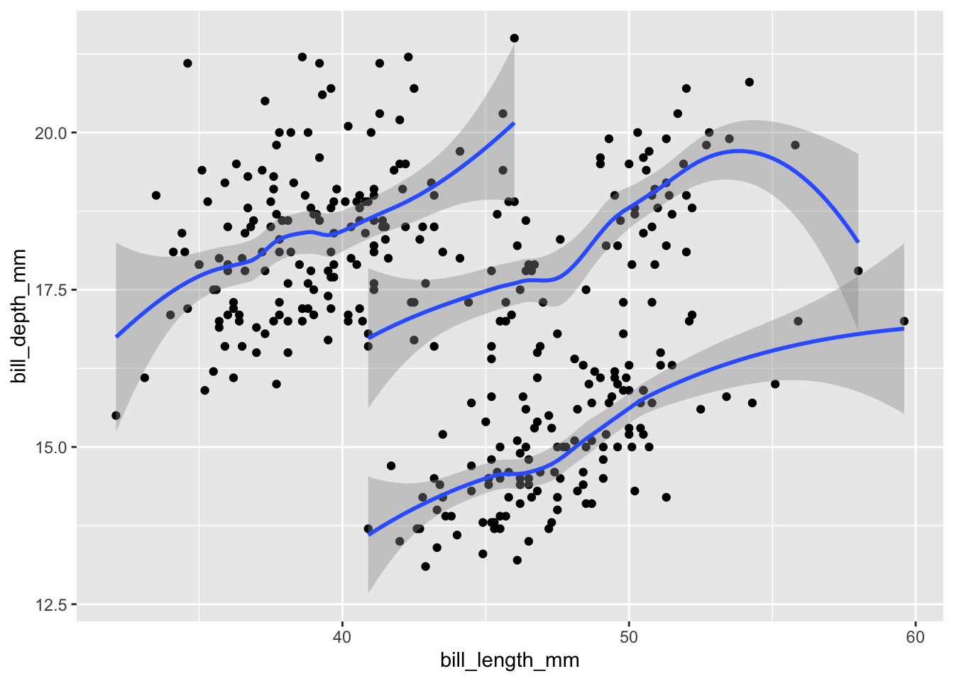
Since all groups are still being displayed within the same plot, it is easy to make it overly complex. Instead, we can focus on each group separately by creating small multiples (or facetted graphs in ggplot2 parlance). facet_wrap() requires a one-sided formula (i.e., the tilde sign plus the variable name) and lays the plots out horizontally; facet_grid() takes a two-sided formula (e.g., island ~ species) to specify a two-dimensional layout:
# 1-dimensional layout with facet_wrap
bill_plot +
  geom_smooth() +
  facet_wrap(~species)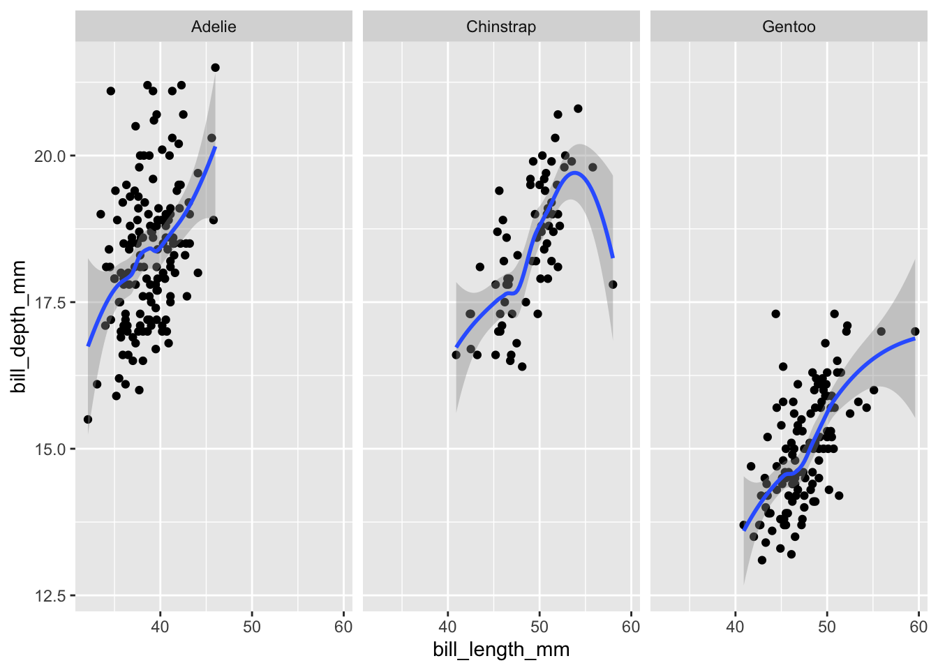
# 2-dimensional layout with facet_grid
bill_plot +
  geom_smooth() +
  facet_grid(island ~ species)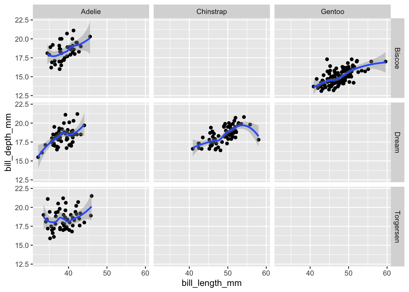
6.2.5 Exercises
6.2.5.1 Question 1
Represent the dataset penguin_weight from earlier as a line graph (geom_line()).
6.2.5.2 Question 2
Explain why it is not straightforward to visualize penguin_weight as a bar chart with geom_bar(). Read the help file to find out how geom_col() can get the job done.
Answer
By default, geom_bar() automatically counts observations – but we already have counts in the data that we would like to display:
penguin_weight
#> # A tibble: 3 × 2
#>    year weight
#>   <int>  <dbl>
#> 1  2007  4125.
#> 2  2008  4267.
#> 3  2009  4210.
geom_col() produces bar charts without performing additional transformations:
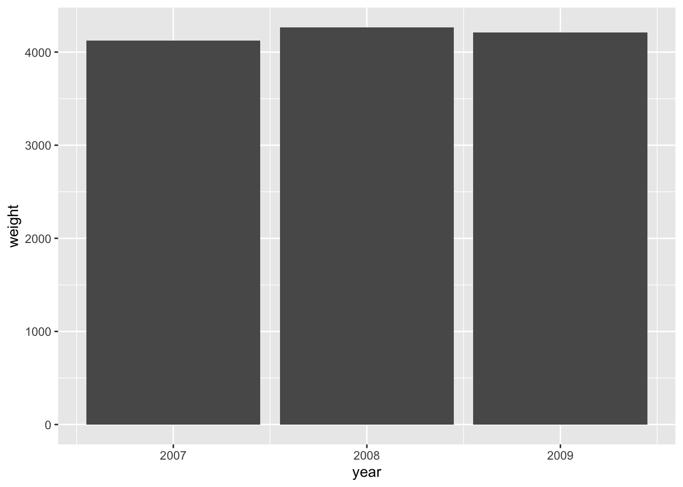
The same can be achieved with geom_bar() by overwriting the statistical transformation (stat):
6.2.5.3 Question 3
Using the penguins dataset, investigate whether taller penguins (in terms of flipper_length_mm) are heavier using a scatter plot. Save your plot in a variable called p.
Answer
There seems to be a strong positive correlation between flipper length and penguin weight:
p <- ggplot(penguins, aes(flipper_length_mm, body_mass_g)) +
  geom_point()

p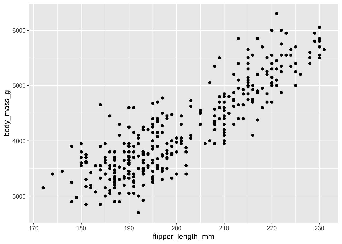
6.2.5.4 Question 4
Add another layer with geom_smooth() to the plot saved in p.
Answer
p + geom_smooth()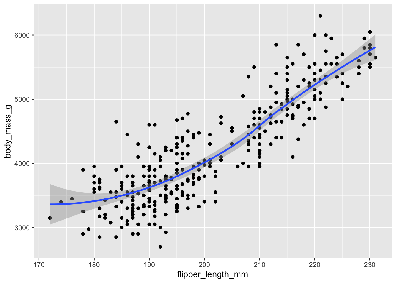
Note that you can overlay a linear fit with geom_smooth() by specifying the argument method = "lm" and turn off the confidence intervals with se = FALSE.
p + geom_smooth(method = "lm", se = FALSE)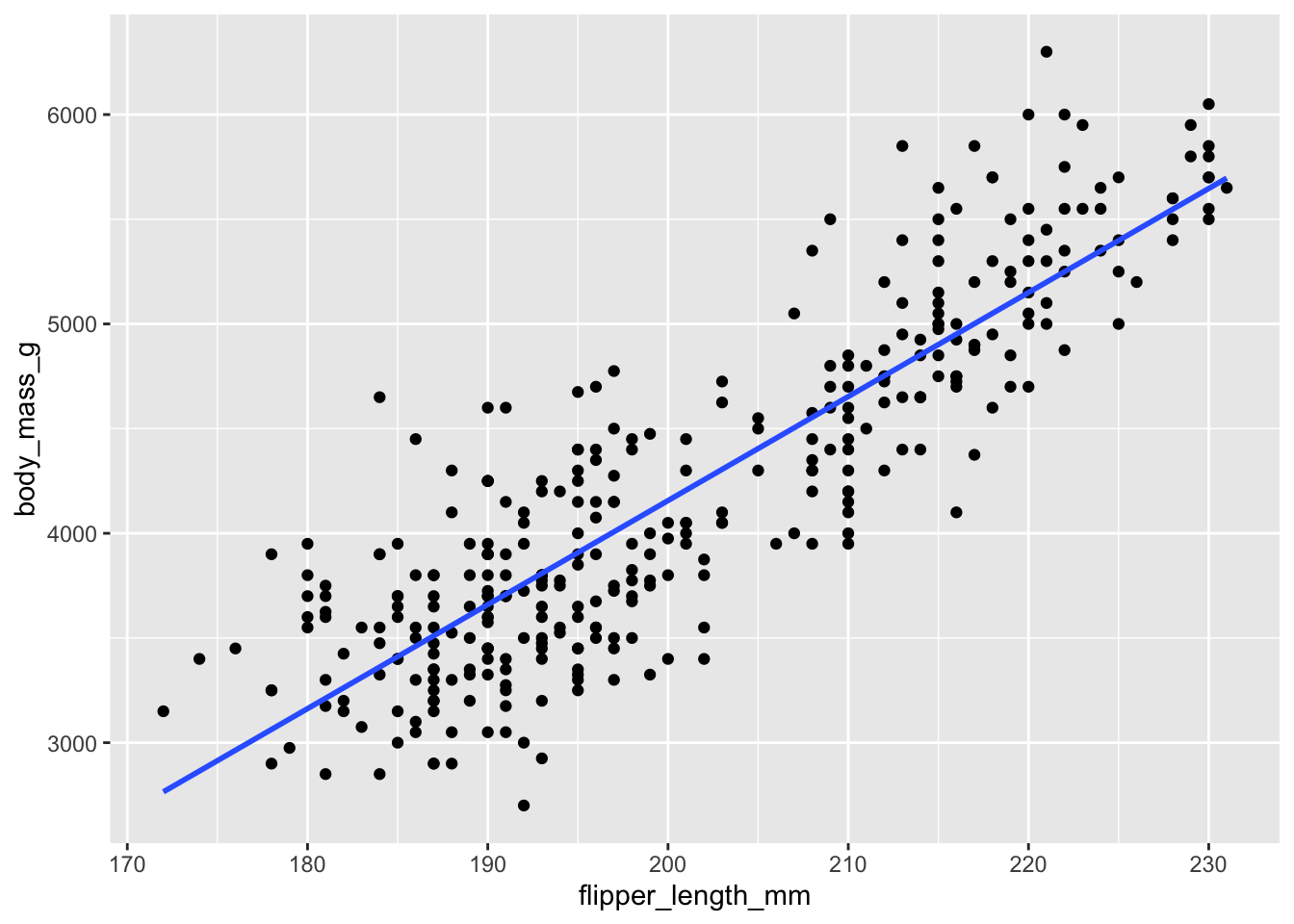
6.2.5.5 Question 5
Explain why the different species do not have different colors in the following code:
ggplot(penguins) +
  geom_point(aes(flipper_length_mm, body_mass_g), color = species)
Answer
color = species is an aesthetic mapping and should go inside of aes().
6.2.5.6 Question 6
Increase the size of the dots (size = 3) in the plot below:
ggplot(penguins) +
  geom_point(aes(flipper_length_mm, body_mass_g))
Answer
3 is a fixed value, not an aesthetic mapping, so it has to be specified outside of aes().
ggplot(penguins) +
  geom_point(aes(flipper_length_mm, body_mass_g), size = 3)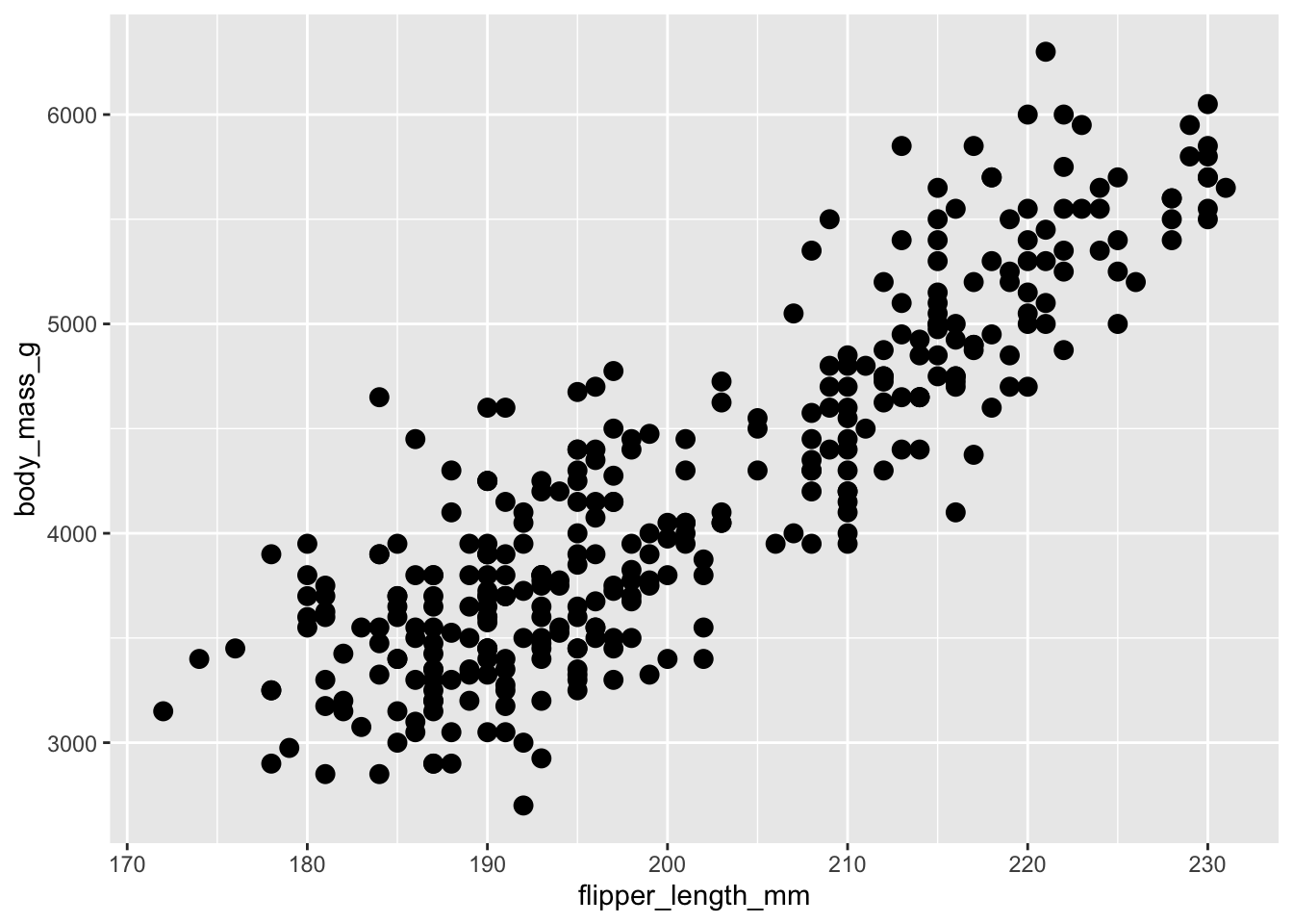
6.2.5.7 Question 7 ⚠️
Restrict the penguins dataset to the heaviest penguin of each species. Then overlay your plot p with another geom_point() showing only these three penguins and color-code their dots according to their species. Your results should look like this:
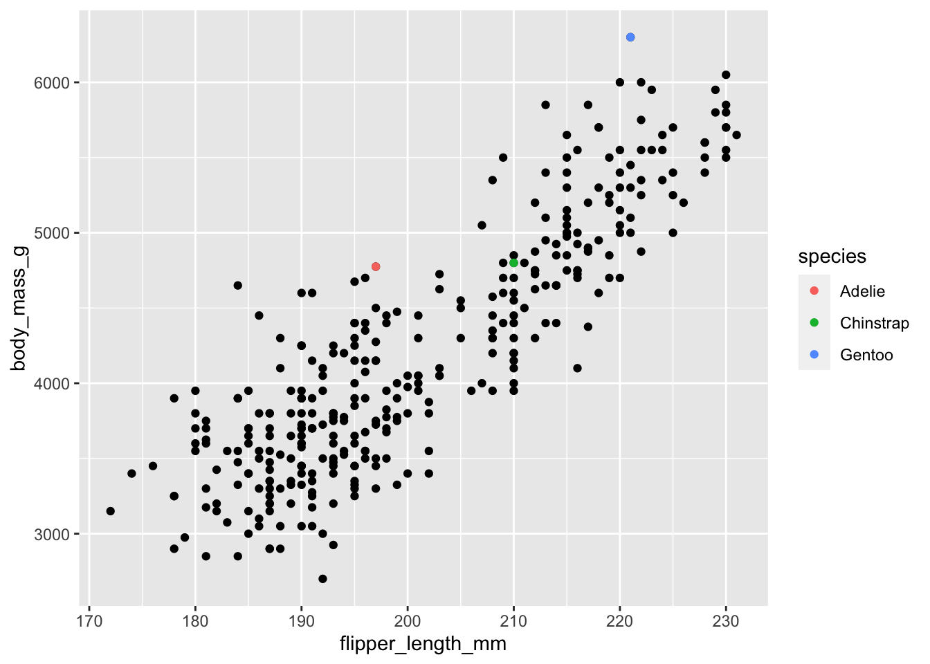
Answer
This exercise involves two parts: filtering the data to identify the heaviest individuals of each species and adding them as a new layer to our plot. In class, the former turned out to be much harder than the latter. Imagine the filtered dataset were already stored in a variable called biggest. Then all we would need to do is to use it in another geom_point() and identify species by color like so:
p + geom_point(data = biggest, aes(color = species))So how do we get the heaviest penguin of each species? This requires some data wrangling and there is certainly more than one way that works. The most intuitive idea might be: calculate the maximum weight for each species, then reduce the dataset to those observations whose weight matches the maximum weight:
biggest <- penguins %>%
  group_by(species) %>%
  mutate(max_weight = max(body_mass_g, na.rm = TRUE)) %>%
  filter(body_mass_g == max_weight)
Another way might sort the data in descending order with arrange() and then slice off the top entry; yet another one might involve a ranking function such as row_number(). The most concise way using the function dedicated for this very purpose involves slice_max():
penguins |>
  group_by(species) |>
  slice_max(body_mass_g)
#> # A tibble: 3 × 9
#> # Groups:   species [3]
#>   species   island bill_length_mm bill_depth_mm
#>   <fct>     <fct>           <dbl>         <dbl>
#> 1 Adelie    Biscoe           43.2          19
#> 2 Chinstrap Dream            52            20.7
#> 3 Gentoo    Biscoe           49.2          15.2
#> # ℹ 5 more variables: flipper_length_mm <int>,
#> #   body_mass_g <int>, sex <fct>, year <int>, big_boy <lgl>
Either way, we are now ready to add the filtered dataset as the top layer to our plot.
6.3 Making a plot publication-ready
Let us take our plot bill_plot and make it both more beautiful and more informative. To spice things up, we will be using the augmented version of our plot with different colors for each species. ggplot2 automatically creates a legend for us that we can modify as well:
bill_plot <- ggplot(penguins, aes(bill_length_mm, bill_depth_mm)) +
  geom_point(aes(color = species))

bill_plot
6.3.1 Labels
First, we will make the plot more informative by providing axis labels, title and subtitle, as well as a caption. All of these enter as name-value pairs inside of the labs() (short for “labels”) function. Note that what might appear as a legend title in the previous plot is actually the name of the variable that was mapped to the color aesthetic (species). To change it, we have to assign a name to this aesthetic using color = "Species".
Note that if you are going to embed the plot in a LaTeX or Word document, you might prefer specifying the plot title and subtitle in the figure environment of your word-processing software rather than baking it into the image file itself.
bill_plot <- bill_plot +
  labs(
    title = "Correlation between bill length and bill depth",
    subtitle = "Species seem to matter",
    y = "Bill depth (mm)",
    x = "Bill length (mm)",
    color = "Species",
    caption = "Source: palmerpenguins"
  )

bill_plot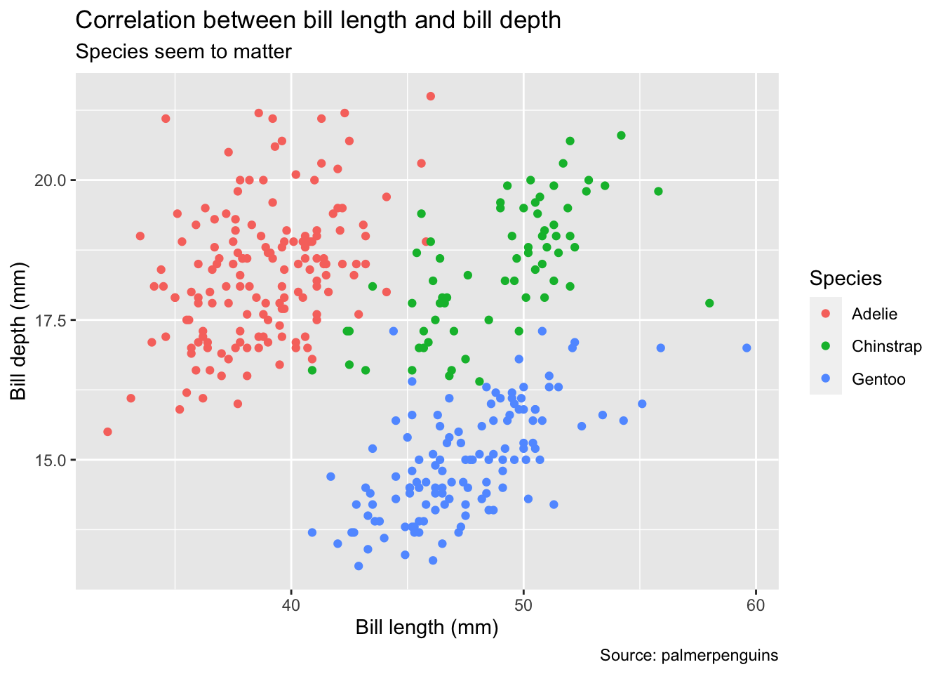
6.3.2 Axes and color scales
Next, we can fine-tune how variables are mapped to aesthetic features of the plot using the group of scale_* functions. Each of these functions has a plethora of options, depending on whether your variable is continuous or categorical. In our case, the variables on the x and y axes are continuous whereas the color aesthetic is mapped to a categorical variable (species). The name scale_* likely stems from the fact that you can actually use them to scale the axes, e.g., by applying a log transformation.
In the example below, we modify a continuous variable (body_mass_g) by manually setting breaks (i.e., which numbers appear along the y-axis) and a categorical variable by manually providing a list of colors. Note that these heavy-handed transformations mainly serve the purpose of illustration – in practice, you will likely use more flexible transformer functions rather than hard-coded replacements or apply pre-made color schemes (e.g., try scale_colour_brewer(palette = "Set1")). For more details, view the help files or read the corresponding chapters 10 and 11 of the ggplot2 book.
bill_plot <- bill_plot +
  scale_y_continuous(breaks = seq(12, 24, by = 2)) +
  scale_color_manual(values = c("orange", "purple", "cyan4"))

bill_plot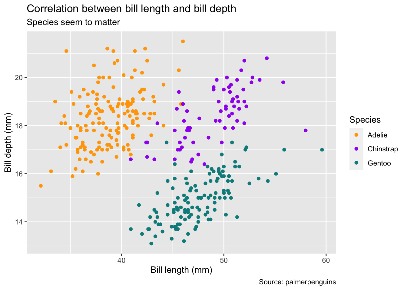
6.3.3 Themes
Finally, we use the theme() function to customize the look and feel of the plot. Unless you are creating a sophisticated template for a journal from scratch, you are likely to stick to one of the theme presets. The theme_minimal() used below is usually a good starting point if you are aiming for a clean, modern look.
One of the few options that you might want to keep being in control of is the legend position. The example code below moves the legend from the right-hand side to the bottom of the plot. Note that theme_minimal() also sets the legend position so we have to overwrite it manually after it has been applied:
bill_plot +
  theme_minimal() +
  theme(legend.position = "bottom")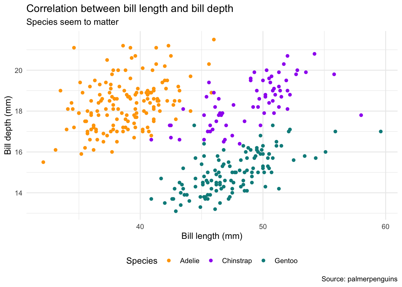
6.3.4 Saving and resolution
The last step of preparing a plot for publication usually involves the mundane task of saving it (unless you are using dynamic documents). Saving a plot sounds trivial at first, yet the command ggsave() to save plots deserves a closer look:
- The first argument is not the plot you want to save but rather the file path to the location where you want to save it. That means you cannot append it to a ggplot2 pipe directly.
- The
plotargument defaults tolast_plot()so you don’t even have to name the plot you want to save. From a reproducibility standpoint, however, you should always name it explicitly. -
ggsave()is smart enough to derive the file format from the file extension.
# create new folder for plots
fs::dir_create("figures")

# save as pdf (vector graphic)
ggsave("figures/plot.pdf", bill_plot)

# save as png (raster graphic)
ggsave("figures/plot.png", bill_plot)
There are many more file formats – the choices here just serve to illustrate ggsave()’s capabilities to produce both vector and raster/pixel graphics. In this case, the vector graphic is more than ten times smaller on disk even though it can be scaled infinitely, without ever looking “coarse”.
6.3.5 Exercises
6.3.5.1 Beauty contest
Try to re-create the plot below, based on the penguins dataset (feel free to remove observations with missing information on sex first). Hint: The color used is called "cyan4" but obviously does not matter much.
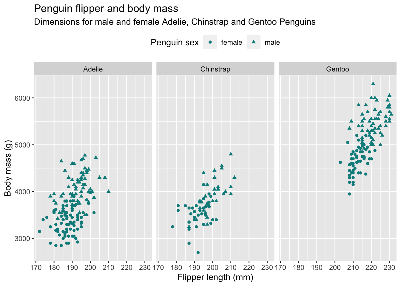
Answer
Apart from using the shape aesthetic, this exercise is just a combination of the modifications introduced above, such as setting labels and theme adjustments as well as producing small multiples.
penguins %>%
  filter(!is.na(sex)) %>%
  ggplot(aes(flipper_length_mm, body_mass_g)) +
  geom_point(aes(shape = sex), color = "cyan4") +
  labs(
    title = "Penguin flipper and body mass",
    subtitle = "Dimensions for male and female Adelie, Chinstrap and Gentoo Penguins",
    x = "Flipper length (mm)",
    y = "Body mass (g)",
    shape = "Penguin sex"
  ) +
  theme(legend.position = "top") +
  facet_wrap(~species)
6.3.5.2 Ugly contest ⚠️
Use the penguins dataset to create the craziest, most uninformative visualization you can come up with. Go crazy with aesthetic mappings. Exploit the theme() options. Setting the background color to green may help you get started: theme(plot.background = element_rect(fill = "green")). See the following example for inspiration:
Figure 6.2: Source: https://www.vizdata.org/ugly-ggplots.html
6.4 References and further reading
-
palmerpenguinspackage documentation: https://allisonhorst.github.io/palmerpenguins/index.html - R for Data Science, chapter 3 (Data visualization)
- The ggplot2 book by Hadley Wickham, Danielle Navarro, and Thomas Lin Pedersen
- Data Visualization: A practical introduction by Kieran Healy
- The R Graph Gallery: Hundreds of charts with reproducible code, sorted by category.
- R Graphics Cookbook, 2nd edition